The Challenge: Bay Area Sound Systems (BASS) needed a branding system that appeals to corporate clients, promoters, and smaller one-off requests. They were in need of a cool logo that appeals to nightlife lovers and professional event coordinators alike.
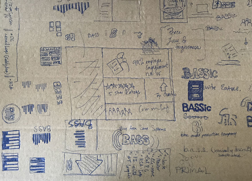
The Solution: We came up with an acronym that is descriptive and practical while also lending itself to the sensible abbreviated expression, BASS. Since he is in the business of renting out audio equipment targeted at the local electronic music scene, this was clearly the perfect name.
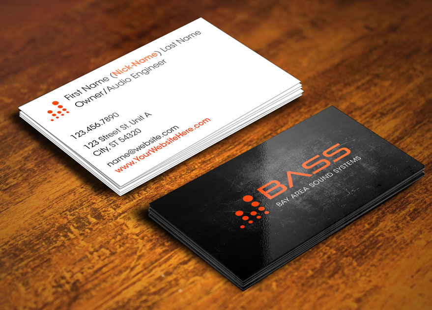
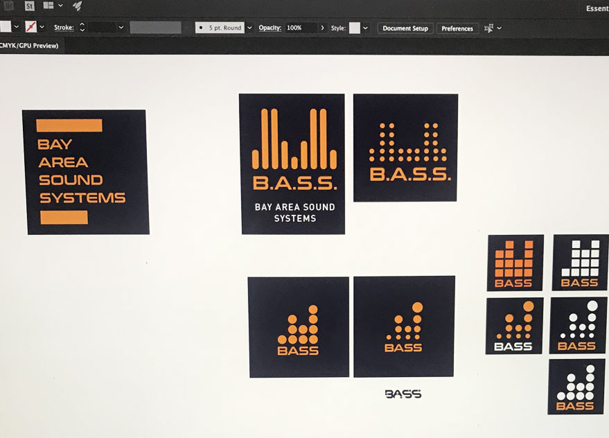
The mark itself is simplistic and sophisticated allowing the brightness of the orange to draw attention without coming off as obnoxious. The floating circles ascend upwards in direction and size suggesting an increase in volume and quality. In an effort to reference some of the well known local iconography of the Bay Area, the graphic is inspired by a section of the Bay Bridge while also doubling as the indicator lights which are practically a hallmark when it comes to audio production equipment.